Pathloom: Optimizing Travel Onboarding & Search
Was responsible for 2 feature design during my internship, including creating an onboarding experience for the web app, and optimizing search experience for travelers. The onboarding experience increased registration rates by 2.8%, and the redesigned search improved navigation vs. search rates by 3.1%.
COMPANY
Pathloom is an agile startup company building for outdoor hikers and campers optimized travel experiences. Pathloom app allows users to discover travel destinations, plan trips, and engage in outdoor communities. As a UX design intern, I was responsible for 2 feature designs under supervision of CEO and design lead.
ROLE
UX Designer
TEAM
Ankit J. (CEO), Siwen L. (Design Lead), Nirali M. (Business Analyst), Nathan W. (Business Analyst)
THE CORE EXPERIENCE
TOOLS
Figma, Whimsical, Notion
TIMELINE
May 2022 - Dec 2022
Onboarding the Pathloom web app, and experience exploratory destination search.
01 / ONBOARDING EXPERIENCE
Envisioning an intuitive introduction to complex features, registering new users.
Breaking down the experience into short journeys
I worked closely with the business analyst on this part to discuss core features that need to be included in the onboarding guidance, based on her business analysis and my user journey analysis. This list we came up with include landing page introduction, comprehensive map exploration, and secondary features like place description and layering. To meet the business object, an end pointer was added to the registration action.
Choosing a card style
To explore the best format of providing feature explanations, I conducted competitive analysis on tooltip variations, and came up with 3 options.
Exploration B: Bite sized, fixed position card, not selected because the mapping between the feature and instructions is not intuitive enough.
Exploration A: Central, progressive feature introductions, not selected because a large number of features make the process prolonged and intimidating.
Designing content and buttons into components
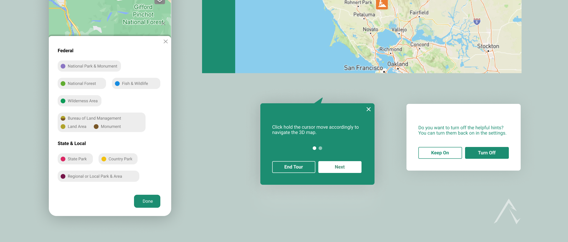
Depending on the length and position of each small onboarding process, I designed different shapes of tooltips including different buttons and progress dots to indicate status and progress.
Pathloom’s web app is feature-rich but unintuitive for new users.
Key findings from user research include:
New users are confused with different layers in the map modality. Pathloom supports filtering different activities and views functionality on the map, and users get intimidated by complex features.
New users are unfamiliar with different feature sections. Pathloom offers destination search and recommendations, and an interactive map modality that embeds advanced mapping filters. Going to the helpful section is not intuitive enough for users.
02 / OPTIMIZING SEARCH
Travelers are stuck in their knowledge of places but lacking explorations.
Key findings from user research include:
Low Discoverability: Overwhelming information with low discoverability and high cognitive load.
Limited Options: Users can only search for places they already know the name of.
Design challenge
Navigation Friction: User friction occurs when users want to relocate and have to exit the page
“How might we help users discover new outdoor destinations and increasing plannings?”
Envisioning a more robust and intuitive search experience.
Defining key task flows
I explored a core idea to create recommendations and personal destination generations for users, based on different use cases. This is intended to increase search and planning rates.
I identified gaps in the current search experience and brainstormed different ways to bridge the gaps.
Ideating a discovery page
I explored a core idea to create recommendations and personal destination generations for users, based on different use cases. This is intended to increase search and planning rates.
Expanding search flexibility by 3.1%.
Tag regrouping increases option discoverability.
The search flexibility is highly expanded by allowing users to search with or without criteria attached and get inspired. The Navigation vs. Search rates increased by 3.1%.
Usability increased because users can now select features at anytime instead of having to input in the start.
Improved usability and navigation.
Usability increased because users can relocate easily on the same page without exiting. More information about the location is provided by the information card in the bottom.
The End. Redirecting you to…
Architecture AI
Funsport Education
Art Community


